In this post, we will explore how to customize the appearance of checkbox using HTML and CSS.
By modifying the default checkbox style, we can create more engaging user interfaces that enhance the overall user experience.
HTML code:
A checkbox is an input element with type="checkbox". It consists of a label and an input element, which are typically nested inside a container element:
<div class="null-check-box-container">
        <input type="checkbox" name="" id="null-check-box" class="null-check-box">
        <label  for="null-check-box">Remember Me</label>
</div><!--End null-check-box-container-->
CSS code for customizing checkbox:
:root{
    --null-color-white:#ffffff;
    --null-color-main:#004bb4;
}

.null-check-box-container {
    display: -webkit-box;
    display: -ms-flexbox;
    display: flex;
    -webkit-box-align: center;
    -ms-flex-align: center;
            align-items: center;
    padding: 20px;
    gap: 5px;
}

.null-check-box-container input[type="checkbox"] {
    position: relative;
    width: 45px;
    height: 15px;
    -webkit-appearance: none;
    background: #c6c6c6;
    outline: none;
    border-radius: 20px;
    -webkit-box-shadow: inset 0 0 5px rgb(0 0 0 / 20%);
    box-shadow: inset 0 0 5px rgb(0 0 0 / 20%);
    -webkit-transition: .5s;
    -o-transition: .5s;
    transition: .5s;
    cursor: pointer;
}

.null-check-box-container input[type="checkbox"]:before {
    content: '';
    position: absolute;
    top: 0;
    width: 15px;
    height: 15px;
    border-radius: 20px;
    left: 0;
    background: var(--null-color-white);
    -webkit-transform: scale(1.1);
    -ms-transform: scale(1.1);
    transform: scale(1.1);
    -webkit-box-shadow: 0 2px 5px rgb(0 0 0);
    box-shadow: 0 2px 5px rgb(0 0 0);
    -webkit-transition: .5s;
    -o-transition: .5s;
    transition: .5s;
}

.null-check-box-container input:checked[type="checkbox"]{
    background:var(--null-color-main);
}

.null-check-box-container input:checked[type="checkbox"]:before{
    left:30px;
}

.null-check-box-container label{
    cursor: pointer;
}
Note: change the main color to your brand color or use it directly.
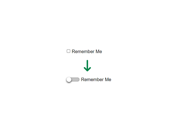
The output will be as below: